WaterRower

Revamping the website's presentation of WaterRower models aimed to alleviate customer confusion, streamline information architecture, and decrease reliance on customer service calls.
Task
Competitive Analysis
Wireframes
Rapid Prototyping
User Interviews
Timeline
6 Weeks
Overview
A well-known brand since 1998, WaterRower makes top-quality rowing machines. Yet today with the 12 models sold on our US website - few can understand the differences. Customer service was being bombarded with calls to clarify model differences rather than finding what they need on the website.
Problem
To address the challenge of customer confusion and reduce the volume of calls to customer service, our objective was to reassess the presentation of product models on the website, aiming to enhance understanding of the offered products. Specifically, our goal was to help clarify the differences between the WaterRower models and improve the flow of how users find this information.
Discovery & Research
Through user behavior analysis using Mouseflow, it was revealed that mobile users struggled to locate the crucial 'compare' page, prompting a redesign aimed at enhancing mobile navigation and content presentation to alleviate customer confusion and improve overall user experience. Additionally, I conducted 5 remote user interviews to better understand these pain points which gave us a better direction for redesigning the compare page.

39% of users are desktop which statistically is where more conversions occur due to the larger screen and the tendency to be stationary and focused while they are in front of it.
61% were mobile users which is harder to convert because of the smaller screen and limited attention span, and limited preparedness to purchase.
Through 5 remote user interviews, three primary pain points emerged: difficulty finding the compare page, confusion stemming from unclear terminology, and a lack of clarity regarding the distinctions between different models.
Customer Pain Points
“I can’t understand the difference between models”
“I am not sure how to locate the compare page”
“I don’t know what the terms mean”
Understanding Pain Points
From analyzing the heat maps on the website, conducting user interviews, and talking to customer service staff it was clear that confusion regarding the website information arctecture, as well as the product was causing frustration amoung customers. Accessing the compare page was difficult as it was found only by visiting the shop page and not listed in the sites main navigation. Terms used to describe the product details were not aligning with customer expectations for example a user would look for the weight limit on a machine and find the weight of the actual machine instead. Along the same lines users would go to the compare page only to be met with a side by side comparison of the same model which did not communicate that it was an effective tool to detect differences between models.

Design
To kick off the design process, I collaborated with our lead developer and marketing director to grasp the business goals and champion a mobile-first approach to website design. My initial step involved creating a paper prototype aimed at addressing essential user needs and aligning them with business objectives. I then tested the initial prototype with customer service representatives who provided direct insights into user feedback, particularly regarding challenges in distinguishing between model types.
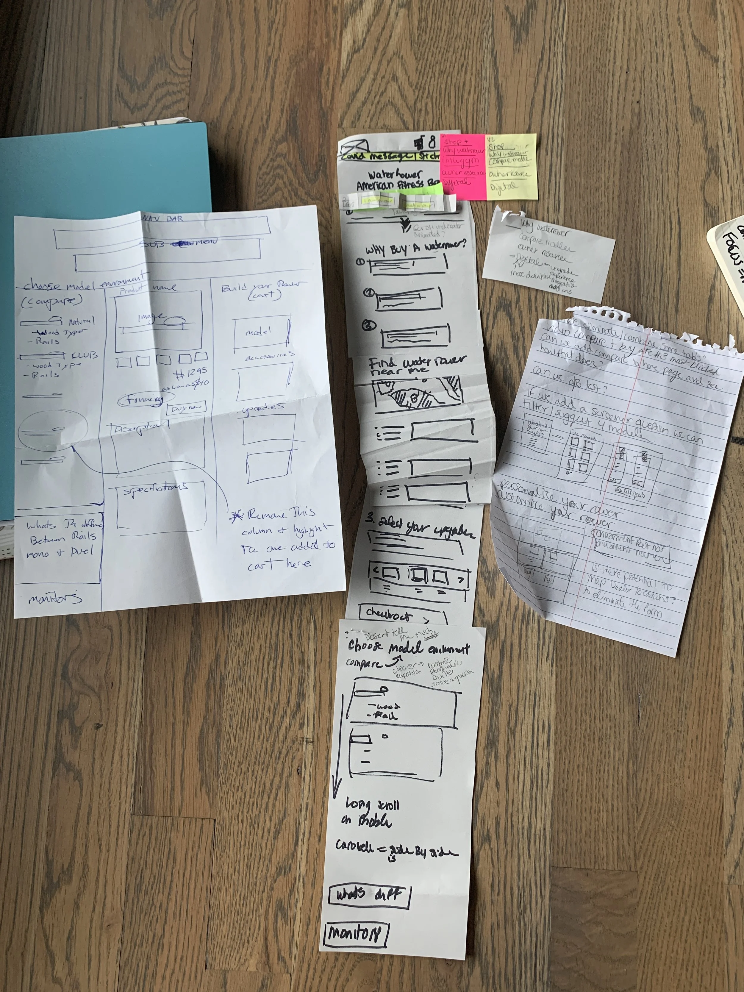
Sketch and Paper Prototype
As our user base was predominantly using mobile devices I wanted to create a design that was focused on small screens. I started with a mobile paper prototype and sketched out my ideas that prioritized user pain points.
Prototype
Using Adobe XD I was able to create wireframes and finally a high fidelity prototype version of the compare page. My intention with this version was to show that by focusing on the similarities rather than differences of the rowers we can create four distinct families with various color and material styles. Grouping rowing machines into families was a strategy to remove unnecessary cognitive load cutting down the confusion and creating a more digestible experience. The ultimate goal after creating this was to further test and define the product attributes that were still confusing to users. In addition, I would have liked to conduct a card sort to better understand if the product family titles fit with our customers expectations.
Outcome
Our initial goal was to redesign the compare page, but this project was deferred when the company prioritized migrating all products to a headless e-commerce website. This transition necessitated extensive evaluation and photo re-uploading. Although the compare page redesign remained a focus, it was reprioritized in favor of updating the new website to separate it from its UI. This decision aimed to ensure better control and safeguard against future UI changes potentially disrupting the website.